POWER SAUCE by Essentis Berlin // Packaging Illustration for Organic Chilli Sauce

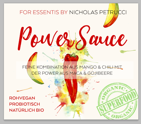
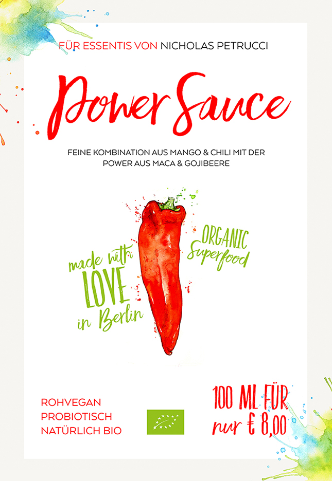
This week I had the pleasure of working with lovely people behind "Essentis" - a new brand created by chef Nicolas Petrucci. The brand "Essentis" shares its name with the popular biohotel in Berlin where Nicolas is head chef. Their first product is a pro-biotic and organic chilli-based sauce named "Power Sauce" and I was asked to create some vibrant chilli and mango-inspired artwork to adorn the product labels.

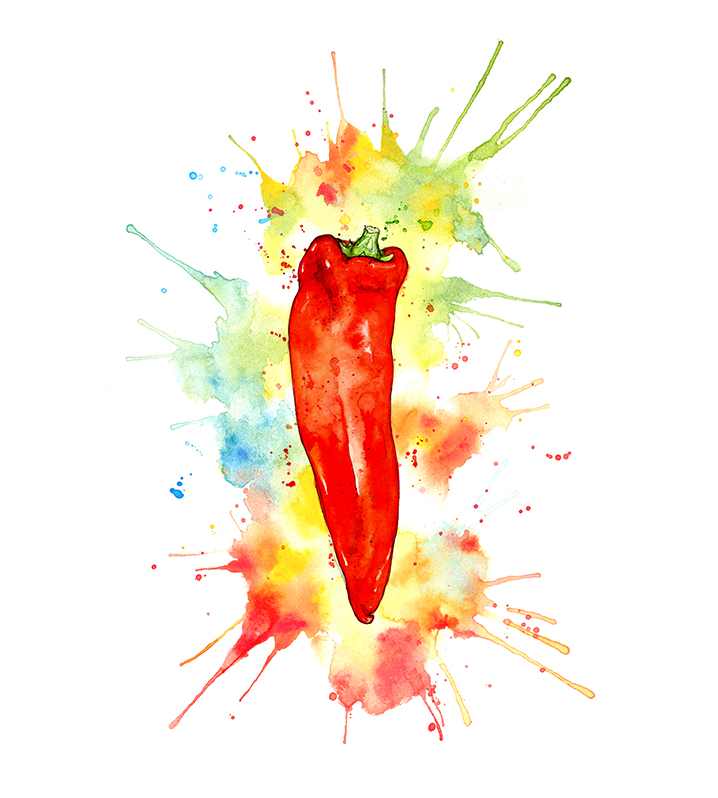
The initial inspiration came from my own chilli pepper painting, which I used as a base to add more colourful watercolour splashes to make it that little bit more exciting(!) and painted new mango slices to match. As you can probably tell, this was a lot of fun to do.

Essentis Biohotel - http://essentisbiohotel.de/en/

 Artwork (C) Amy Holliday 2016

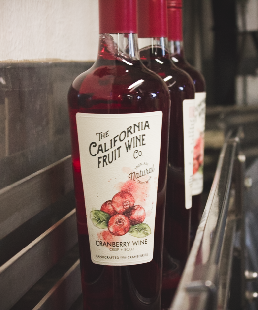
Photography (C) Essentis by Nicolas Petrucci 2016

California Fruit Wine Co. // Pumpkin & Cranberry Fall Wines

Shortly after I created some fruity illustrations for California Fruit Wine Co.'s labels, a second batch was needed. This time it was "Pumpkin Spice" and Cranberry, whose flavours have just been released for the Fall/Autumn season. Yum!

Cranberries colour small.jpg

California Fruit Wine Co. website: www.californiafruitwine.com

California Fruit Wine Co. on Instagram: https://instagram.com/cfwco/


Artwork (C) Amy Holliday 2015

Photos (C) California Fruit Wine Co. 2015


California Fruit Wine Co. // Illustrations for Wine Labels

Way back at the start of the year, I was asked to create some fruity label illustrations for the fabulous California Fruit Wine Co.  The San Diego winery is the pioneer producer of all natural wines handcrafted from fruits other than grapes.

I illustrated each fruit separately and then placed pairs together where needed, working within the format of the labels. The style of the series is based on my own pineapple illustration (you might recognise!) from last year.

Amy Holliday pineapple small.jpg


California Fruit Wine Co. website: www.californiafruitwine.com

California Fruit Wine Co. on Instagram: https://instagram.com/cfwco/


Artwork (C) Amy Holliday 2015

Photos (C) California Fruit Wine Co. 2015


Avocado Studies // Watercolour and graphite vs watercolour and ink

A little experiment with a simple subject matter, the humble but super healthy avocado fruit. A lot of people believe the majority of my work is made with watercolour and ink, yet this is not the case as I usually don't use any ink. So! I thought I would give ink a go - here is a comparison showing the two techniques on different illustrations of the same subject. 

Here is my regular go-to technique, simply graphite and watercolour:

And below are more avocado studies, this time using watercolour and ink:

I really enjoyed using the ink with my watercolour - surprisingly it is also a little quicker to complete than my usual graphite and watercolour technique. It does seem to create a different overall look to the illustration, perhaps a more fun, sketchy vibe than the traditional, more polished feel the graphite exudes. I will definitely continue to experiment with more watercolour + ink illustrations.

Do you have a favourite out of the two styles? Let me know your preference in the comments! :) 

 Artwork (C) Amy Holliday 2015. Please do not use without permission.